Derek Thompson
The Atlantic
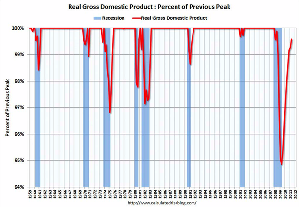
This is a remarkable sequence of pictures from Calculated Risk showing that no major economic indicator has returned to its pre-crisis level. In other words, after two years of recovery, not a single key broad measure of the economy has actually recovered.
The ingenious thing about these graphs, which I’ve never before seen, is that they compare key recession indicators as a share of their pre-recession peaks. The outcome reveals each recession in the last 50 years as a kind of hanging icicle. Ours is by far the longest, and we don’t yet know when we’ll trace our way back to the 2007. Here’s why I don’t expect the path up to get much smoother in the near future.


The climbing line in 2011 is clearly drawn by phantasy!
Without jobs can not increase the consumption and without consumption the tax revenues decline and thereby reduced public spending! As the same time increases the borrowing, and a growing share of tax revenue flows into paying the interest on the huge public debt.